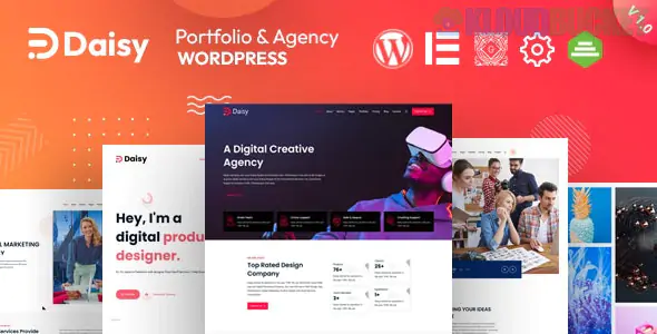
**Daisy** is a breath of fresh air in the creative agency space. While *Montserrat* is geometric and bold, and *Freeman* is minimalist and elite, **Daisy** focuses on **vibrancy, playfulness, and high-energy motion.** It is designed for agencies that want to appear "human," approachable, and cutting-edge—perfect for social media marketing firms, Gen-Z focused branding agencies, and creative studios that aren't afraid of color.
---
### What Makes Daisy Unique?
* **Experimental Layouts:** Daisy breaks the "boring box" mold. It features unconventional grid systems where images and text overlap in a way that feels like a digital magazine.
* **Liquid Animations:** One of Daisy's hallmarks is its use of "liquid" or "blob" shapes and smooth, organic transitions that make the site feel alive as you scroll.
* **Interactive Showcases:** It includes unique portfolio hover effects—such as images that follow the cursor or "distort" slightly—to keep users engaged.
* **Elementor at its Core:** It is built to be "Zero Code," leveraging the full power of the Elementor builder to allow for deep visual customization without technical headaches.
### Comparison: Daisy vs. Montserrat vs. Intimate
| Feature | **Daisy** | **Montserrat** | **Intimate** |
| --- | --- | --- | --- |
| **Energy Level** | High / Playful | Medium / Professional | Low / Calm |
| **Design Style** | Organic & Vibrant | Geometric & Bold | Minimalist & Soft |
| **Best For** | Social/Digital Agencies | Modern Corporations | Lifestyle Freelancers |
| **Main Strength** | Unique Animations | Structural Balance | Whitespace & Clarity |
---
### The Anatomy of a "Daisy" Homepage
Daisy is structured to tell a visual story. It moves away from the traditional "Hero > Features > Team" flow in favor of a more immersive experience.
1. **The "Vibe" Header:** Usually features a large, animated headline with a unique font choice that sets the brand's voice immediately.
2. **The Scrolling Portfolio:** Uses horizontal or staggered vertical scrolling to show off projects in a non-linear way.
3. **The Client "Marquee":** Instead of a static grid of logos, Daisy often uses a moving ticker or "marquee" for social proof, which adds a sense of constant activity.
4. **The Bold Footer:** Unlike the "utility" footers of corporate themes, Daisy’s footers are often massive, colorful, and serve as a final creative statement.
---
### Technical Snapshot
* **Responsive & Retina:** Every "blob" and animation is optimized to ensure they don't break on mobile devices.
* **One-Click Demo:** Offers various "flavors" (Portfolio, Agency, Studio) that change the entire look and feel with one click.
* **SEO Friendly:** Despite the heavy animations, the code is optimized to ensure search engines can still crawl your content effectively.
* **WPML Support:** Ready for global agencies looking to reach an international audience.
---
### Pro-Tip: Don't Over-Decorate
Because **Daisy** comes with so many "fun" elements (blobs, animations, hover effects), the biggest mistake is using all of them at once.
* **Pick one "Signature" Animation:** If you use liquid transitions, keep your hover effects simple.
* **Balance with Whitespace:** Use white space to ground the vibrant colors so the user's eyes don't get overwhelmed.
* **High-Speed Hosting:** Since Daisy uses a lot of JavaScript for its creative effects, ensure you’re using a high-quality host (like WP Engine or SiteGround) to keep the "snappiness" of the animations.
**Would you like me to help you brainstorm a color palette that fits Daisy's "vibrant" aesthetic, or shall we look at how to set up the unique "cursor-follow" effects for your portfolio?**
Subscribe to access unlimited downloads of themes, videos, graphics, plugins, and more premium assets for your creative needs.
Published:
Feb 03, 2026 12:03 PM
Version:
v1.1
Category:
Developer:
ThemeforestLicense:
GPL v2 or LaterTags: